
N. Natural Beauty Basic Futako Tamagawa RISE
2011.03 / Futakotamagawa , Tokyo
- client
- SANEI-INTERNATIONAL
- url
- http://www.sanei.net
- space area
- 200.02m2
- construction trader
- MESSE
- lighting
- 1LUX
- photographer
- Kozo Takayama
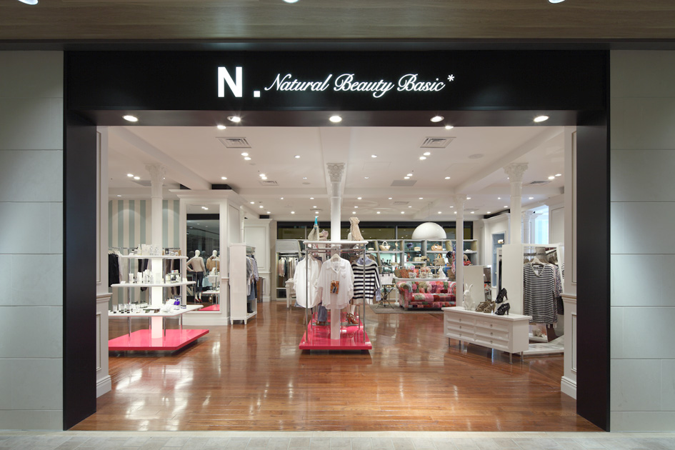
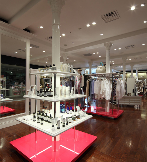
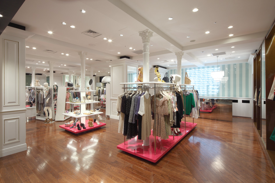
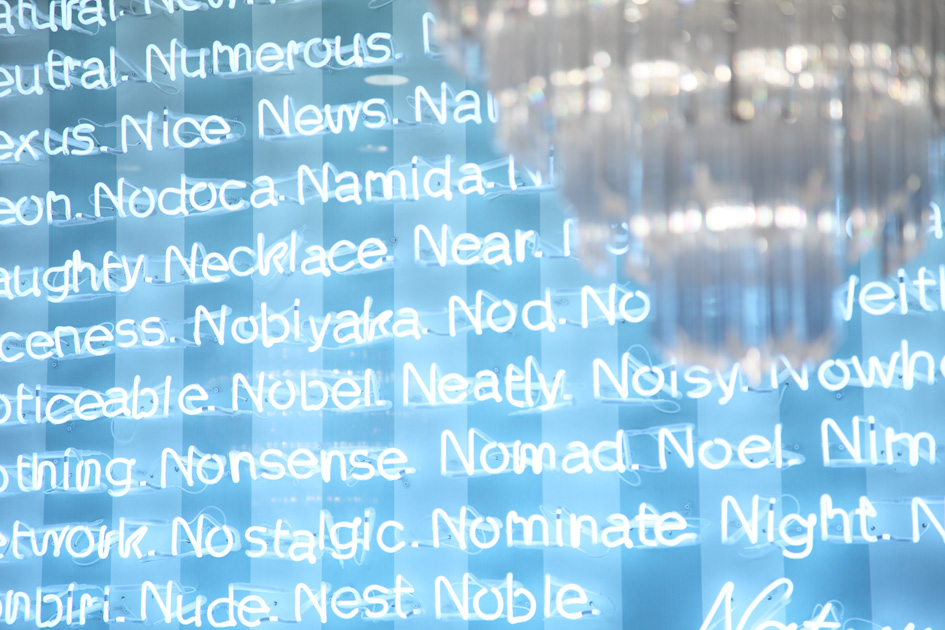
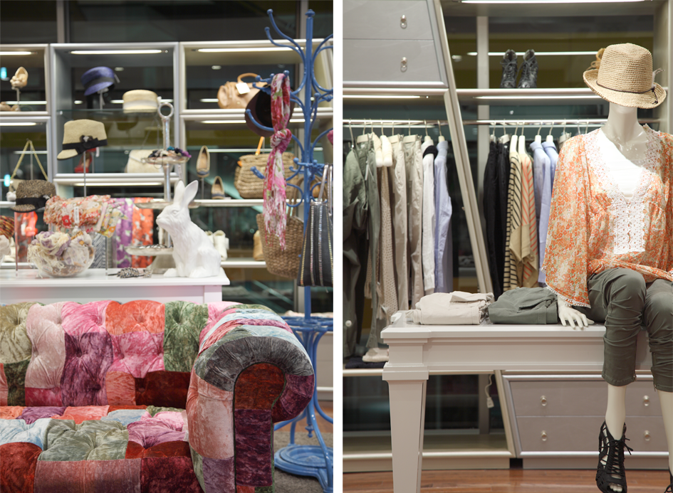
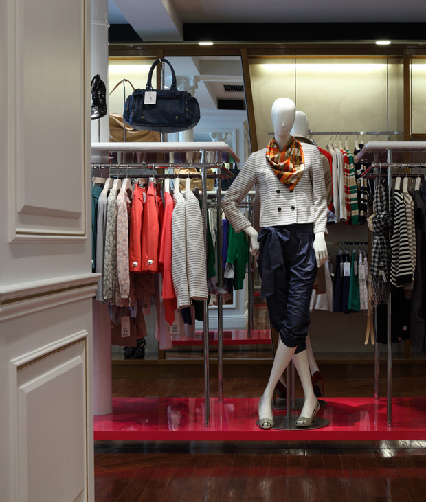
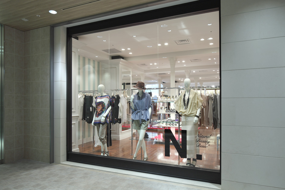
This is a sister brand to the popular Japanese shop "Natural Beauty Basic". Various interior elements inspired by the first letter of the brand's name have been brought into a classic setting reminiscent of "medieval Europe". These include N-shaped display fixtures, an N-shaped pattern in the floorboards, and an unintentional allusion to the letter N in the use of neon lights (which starts with the letter N). Through these elements Jamo was able to make use of the technique of contrast to delineate a modern sense of space out of a flat white area, which otherwise gives the impression of a trip through a modern art gallery. Decorative columns are placed regularly throughout the space to create a sense of rhythm and to tie the overall space together. Additionally, the columns were made to be used as display fixtures. By adding only necessary functions to existing architectural elements Jamo experimented with creating store fixtures that establish a more coherent sense of space. The bright pink platforms that have been placed strategically here and there throughout the store were also chosen from the perspective of creating contrast.
国内の人気ショップである、NATURAL BEAUTY BASICの姉妹ブランド。無作為に羅列された、「N」から始まる単語のネオン、斜めに傾いた「N」のフォルムの什器、巨大な「N」を貼り分けたフローリングなど、中世ヨーロッパを思わせるクラシックな様式に、ブランド名「N.Natural Beauty Basic」の「N」にインスパイアされた数々のインテリアエレメントを落とし込むことで、モダンアートギャラリーを回遊しているかのような面白さと、そこから今の空気感で切り取った「対比の美」を用いた。規則的に配置した装飾柱によって、空間にリズムと統一感を出し、柱に什器としての機能を持たせた。既存の建築要素に必要な機能のみを付加することで、より一体感を持った店舗什器を創造しようというデザインを試みた。ところどころに効果的に配された強い色調のピンクのステージも、「対比の美」の考えに基づいた選択である。