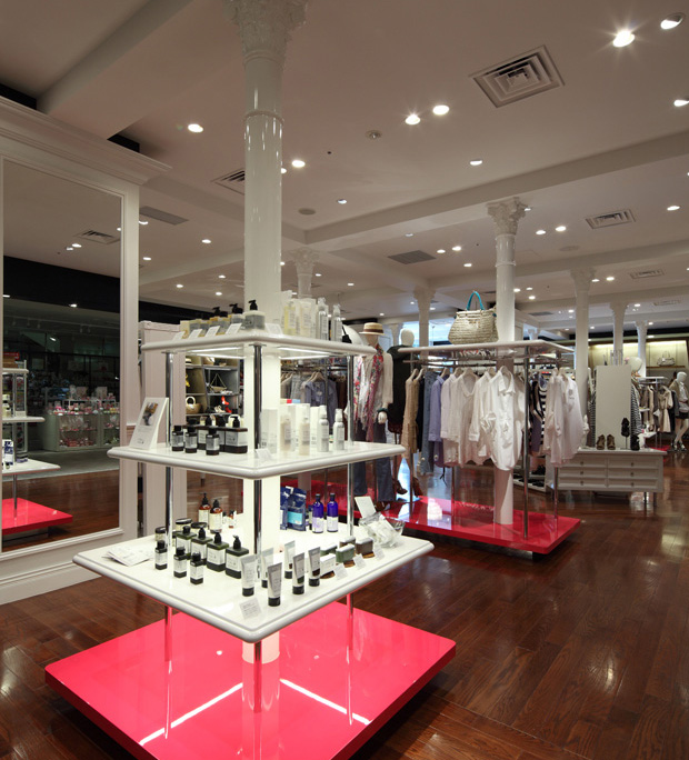
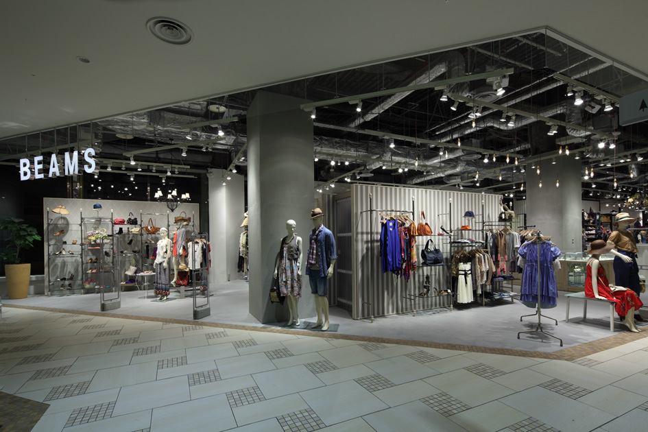
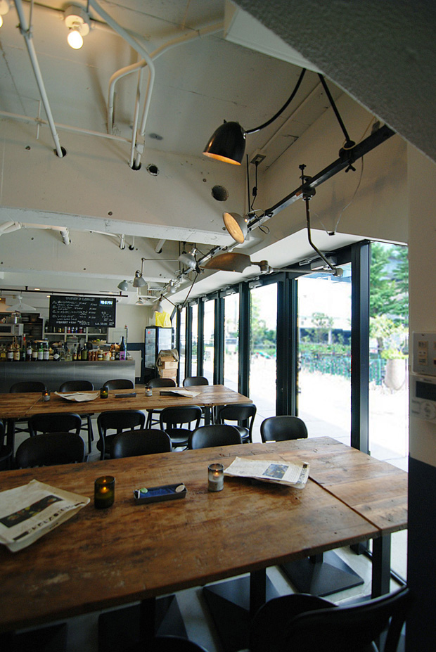
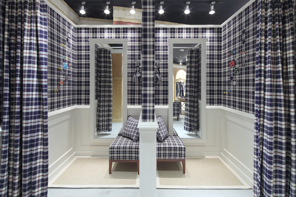
Jamo associates - Project

月別: 2011年3月

client :
mammina
url :
http://www.mammina.co.jp
space area :
212.87 m2
movie :
NAKED INC.
garden design :
kojien
flower direction :
Yasutaka Ochi
construction trader :
DECOR Co.,Ltd.
photographer :
Kozo Takayama

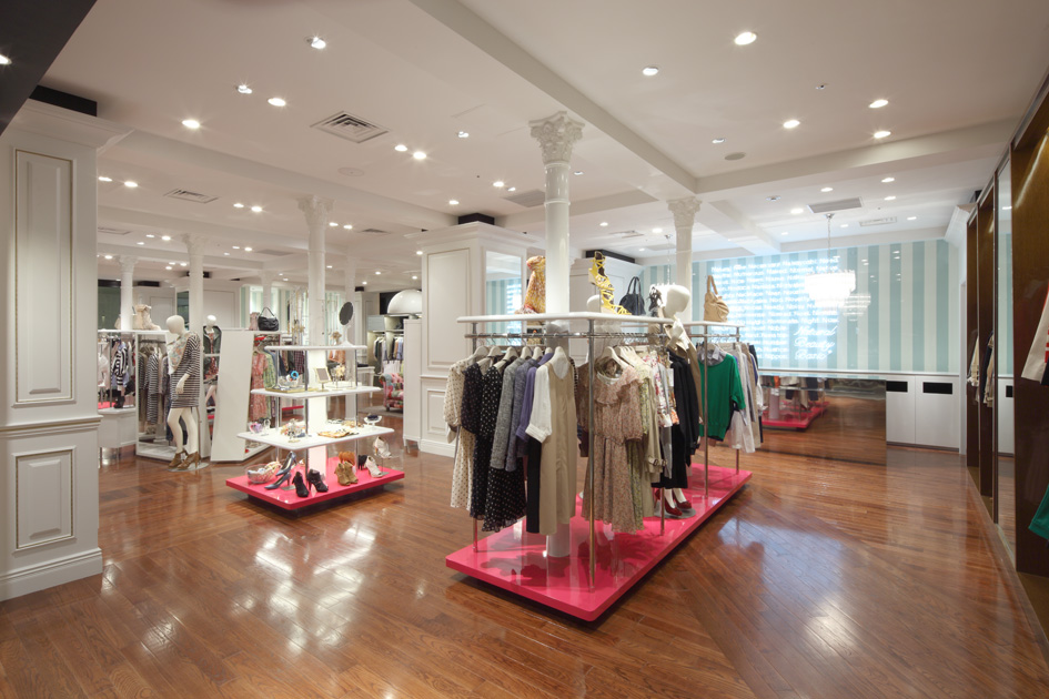
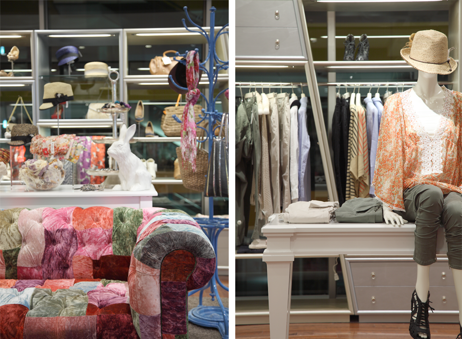
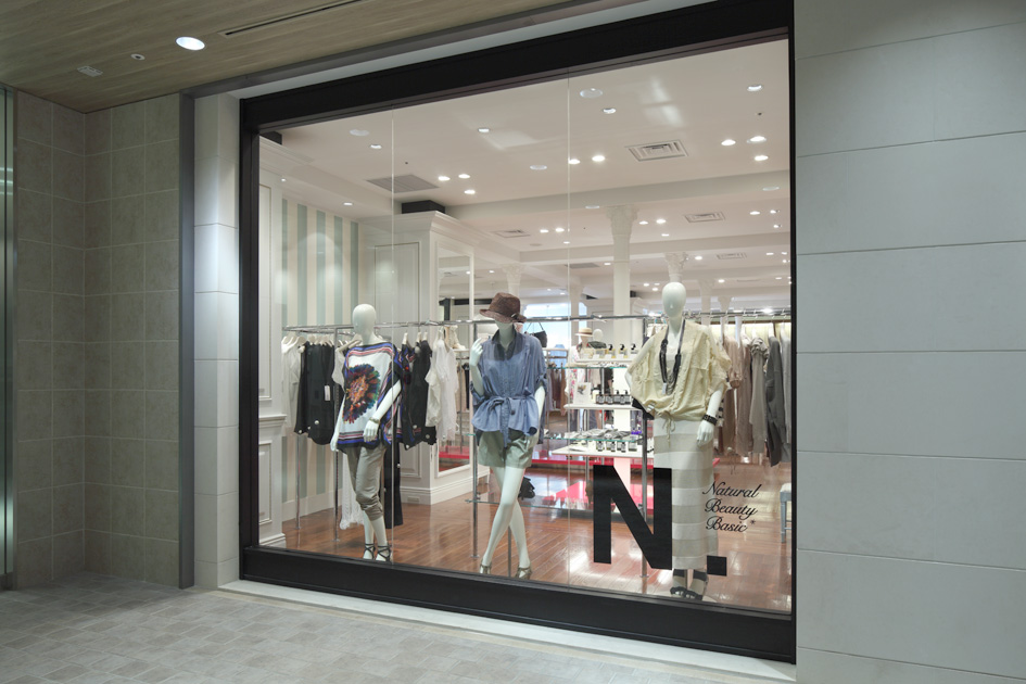
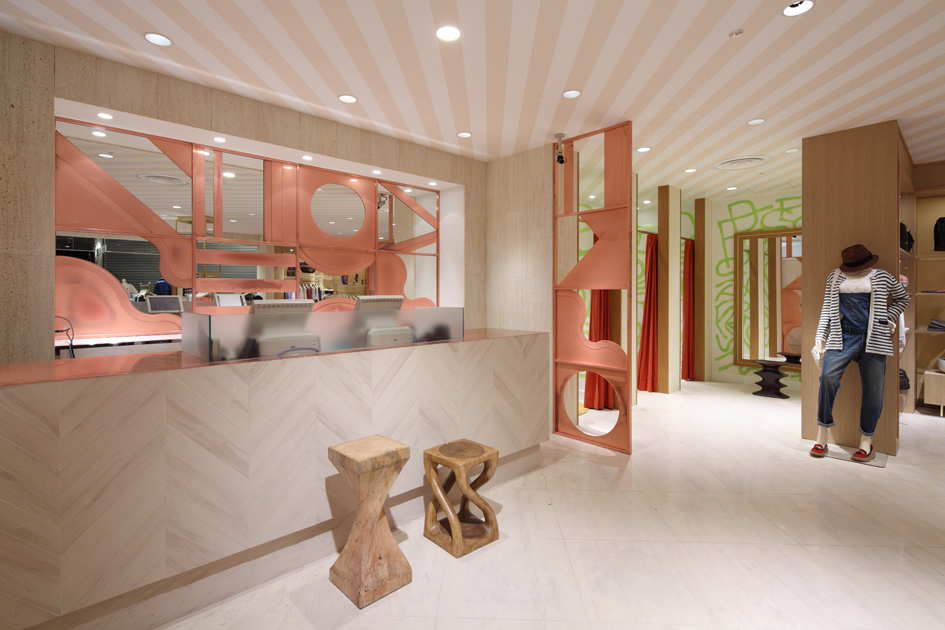
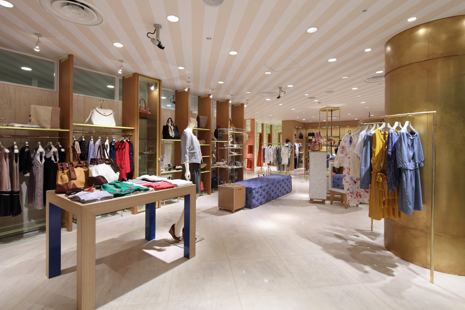
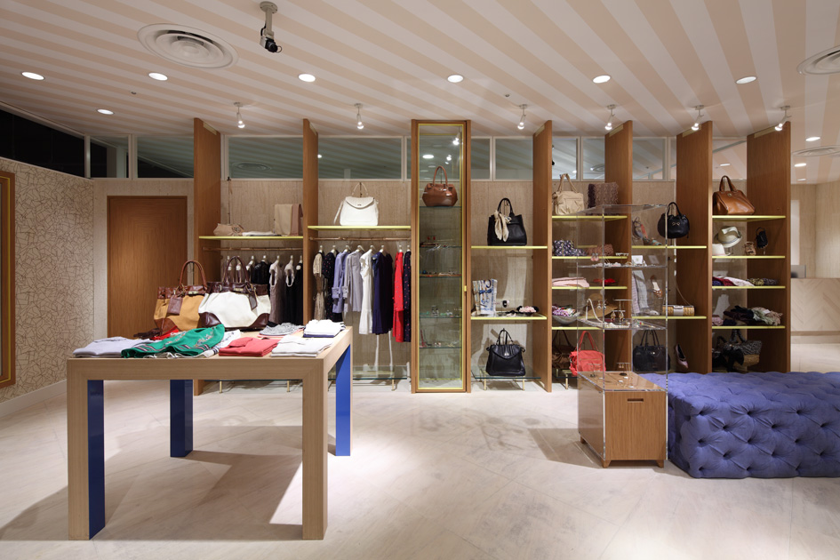
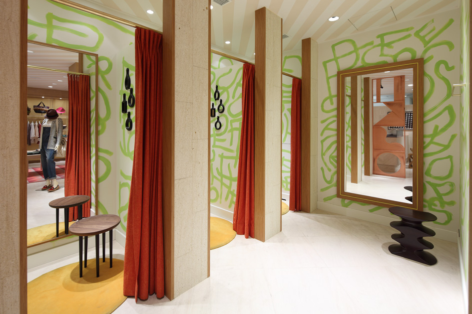
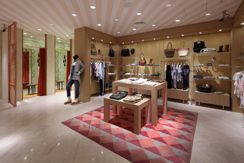
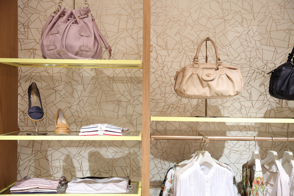
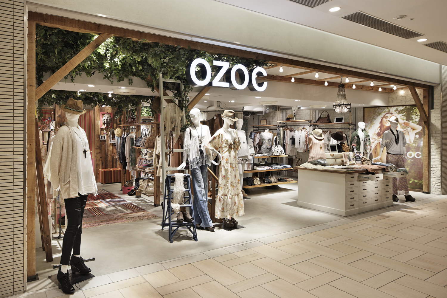
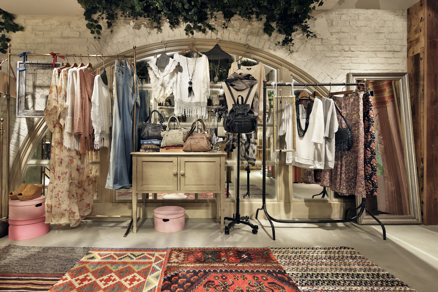
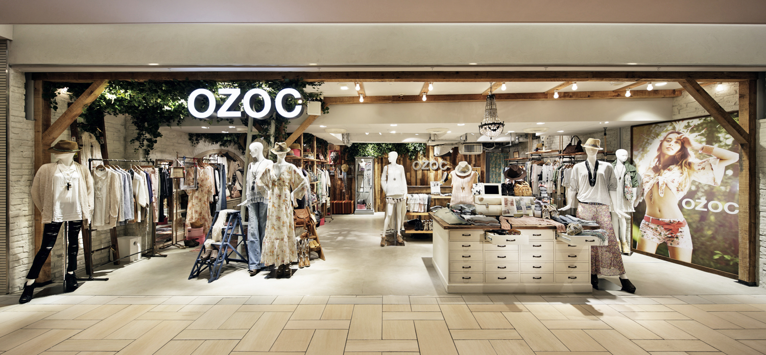
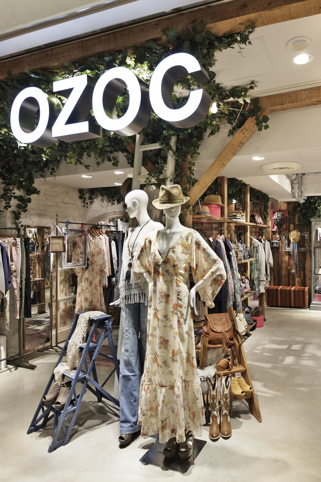
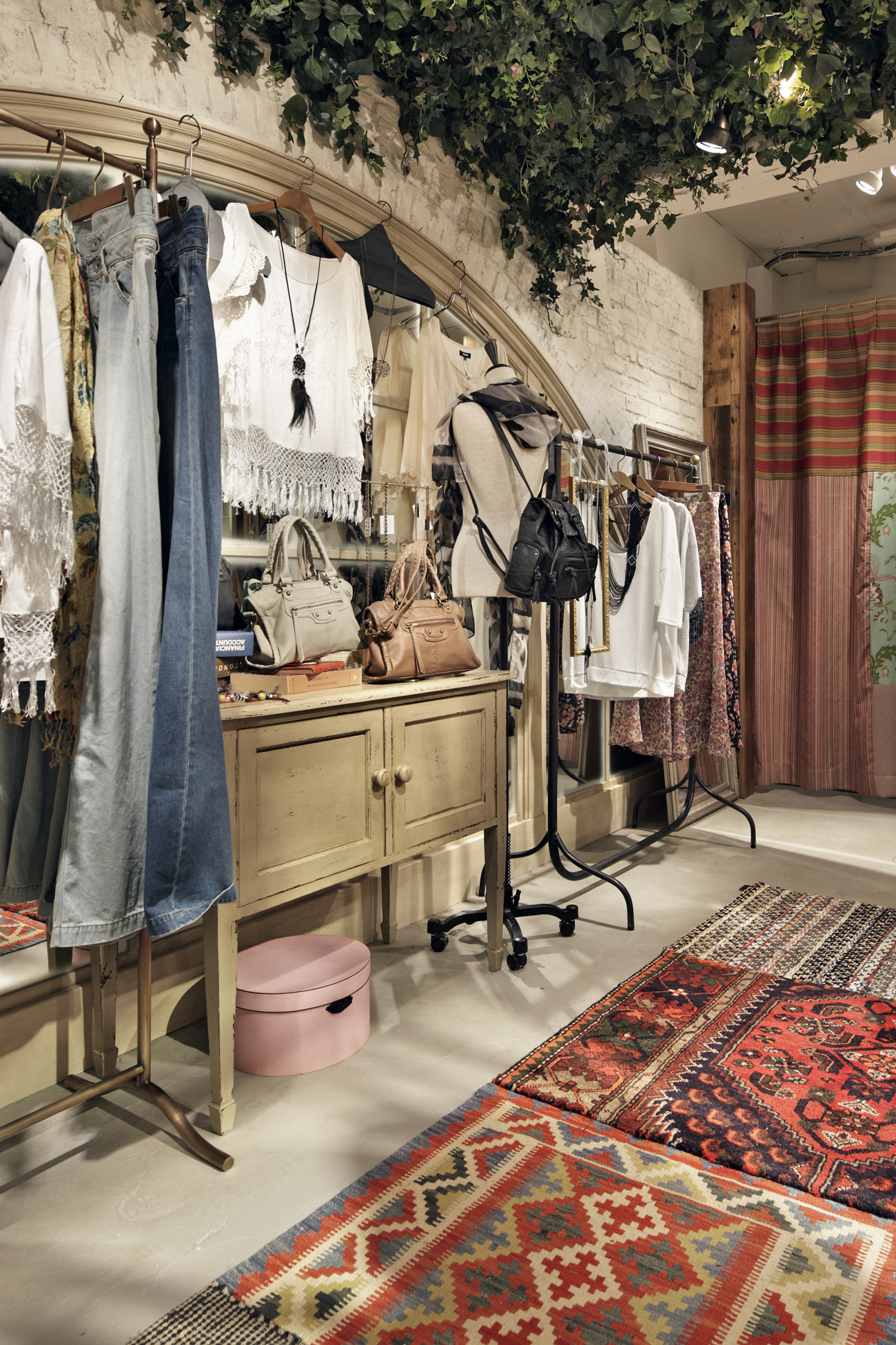
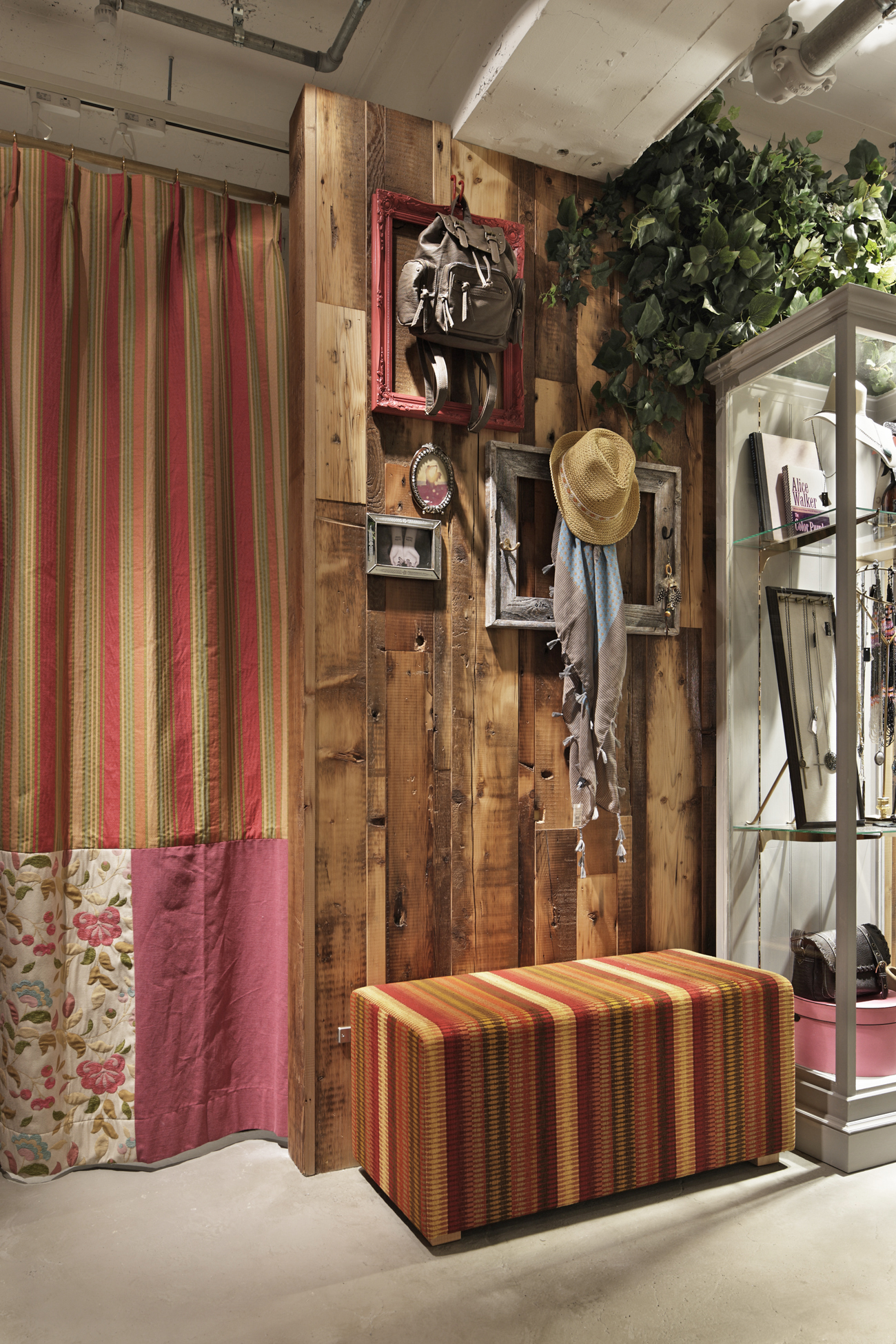
The brand OZOC reopened their store in the first basement level of Lumine East, a large shopping center adjacent to Tokyo's Shinjuku Station. In order to make visitors feel the OZOC's unique sense of style, Jamo's idea was to clearly divide the space into "functional sales areas" and areas where the "brand's sense of style" is pinpointed through visual merchandising. The brand's sense of style is expressed through the theme of "the bedroom of a girl who loves to travel"; this is seen primarily around the fitting rooms where the "bedroom" is made out of distressed reclaimed materials and decorated with antiques, plants, fabrics and picture frames "collected from around the world". Functional sales areas are composed mainly from floor-standing display fixtures; these provide a flexible framework that can be easily changed to fit each day's flow of customers, shop manager's intuition, or new product line-up.

駅に直結する大型ショッピング施設、ルミネエストB1Fのリニューアルオープン。独自の世界観を印象的に人々に訴えられるよう、空間を、VMDに特化した"ブランドの世界観"と、"機能的な売り場"に明快に分け、それぞれ存分に両者の機能を果たすことを考えた。前者はフィッティングルームまわりを中心に「旅好きな女の子の部屋」を演出。ラフな古材の部屋に世界各国で集めた生地やフレーム、アンティーク小物、植物などを散りばめた。後者は置き式什器をメインに構成。その日のお客様の流れ、店長の気分、シーズン、商品のラインナップにより容易にレイアウトを変えることが出来るフレキシブルな機能に特化した。

月別: 2011年3月

client :
mammina
url :
http://www.mammina.co.jp
space area :
212.87 m2
movie :
NAKED INC.
garden design :
kojien
flower direction :
Yasutaka Ochi
construction trader :
DECOR Co.,Ltd.
photographer :
Kozo Takayama

This is a sister brand to the popular Japanese shop "Natural Beauty Basic". Various interior elements inspired by the first letter of the brand's name have been brought into a classic setting reminiscent of "medieval Europe". These include N-shaped display fixtures, an N-shaped pattern in the floorboards, and an unintentional allusion to the letter N in the use of neon lights (which starts with the letter N). Through these elements Jamo was able to make use of the technique of contrast to delineate a modern sense of space out of a flat white area, which otherwise gives the impression of a trip through a modern art gallery. Decorative columns are placed regularly throughout the space to create a sense of rhythm and to tie the overall space together. Additionally, the columns were made to be used as display fixtures. By adding only necessary functions to existing architectural elements Jamo experimented with creating store fixtures that establish a more coherent sense of space. The bright pink platforms that have been placed strategically here and there throughout the store were also chosen from the perspective of creating contrast.

国内の人気ショップである、NATURAL BEAUTY BASICの姉妹ブランド。無作為に羅列された、「N」から始まる単語のネオン、斜めに傾いた「N」のフォルムの什器、巨大な「N」を貼り分けたフローリングなど、中世ヨーロッパを思わせるクラシックな様式に、ブランド名「N.Natural Beauty Basic」の「N」にインスパイアされた数々のインテリアエレメントを落とし込むことで、モダンアートギャラリーを回遊しているかのような面白さと、そこから今の空気感で切り取った「対比の美」を用いた。規則的に配置した装飾柱によって、空間にリズムと統一感を出し、柱に什器としての機能を持たせた。既存の建築要素に必要な機能のみを付加することで、より一体感を持った店舗什器を創造しようというデザインを試みた。ところどころに効果的に配された強い色調のピンクのステージも、「対比の美」の考えに基づいた選択である。

月別: 2011年3月

client :
mammina
url :
http://www.mammina.co.jp
space area :
212.87 m2
movie :
NAKED INC.
garden design :
kojien
flower direction :
Yasutaka Ochi
construction trader :
DECOR Co.,Ltd.
photographer :
Kozo Takayama

This Beams shop directly abuts a major train and subway station. As a result the customers span a wide range of age groups and the items offered by the store range from casual wear to office wear and diverse accessories. In order to neatly organize the many items offered at this store, Jamo came to call this a "unit" project and began from the starting point of developing display fixtures. Here the "unit" becomes a large independent box-shaped fixture to which are added various concepts with the aim of creating seamless customer service. In the exterior part of the "box" Jamo created a space for signage and displays as well as a system where shelves and hangers can be attached in order to display product. Fitting room and storeroom functions are assigned to the interior part of the "box".

駅に隣接する場所柄、訪れる年齢層が幅広く、カジュアルなアイテムからオフィスウェア、アクセサリー類など幅広いアイテムを揃える。数多くのアイテムを整理するために、このプロジェクトはまず「ユニット」と呼ばれる造作什器の開発からはじめた。「ユニット」は独立した大きな箱型の什器であり、スムースな接客を目的に様々な工夫を取り入れた。外側には、サインとディスプレイスペース、商品陳列のための棚板やハンガーを取付可能なシステムを用意し、箱の内側にはフィッティングやストックのためのスペースを設けた。実際の店舗においても、6mを超えるスケルトン天井と、45mあるモルタル床を持つダイナミックな空間に、高さやサイズが緻密に計算されたそれぞれのユニットをリズミカルに配置。意匠感はコーナー毎に変えて、この店舗でもやはり各セクションの持つ世界観を表現した。システマチックな堅苦しさを感じさせず、機能を追求した。常に業界をリードし続け、アパレル販売を熟知した、BEAMSが提案する新しいショップの形態となったであろう。

月別: 2011年3月

client :
mammina
url :
http://www.mammina.co.jp
space area :
212.87 m2
movie :
NAKED INC.
garden design :
kojien
flower direction :
Yasutaka Ochi
construction trader :
DECOR Co.,Ltd.
photographer :
Kozo Takayama

Jamo originally designed the interior for FREE'S SHOP in 2006 and then again for a redesign in 2011 when the store decided it wanted to "age together with their customers" and offer a more relaxed shopping atmosphere for a slightly older woman. The primary materials used are limestone and teak and the atmosphere throughout the store was made one of lightness and calm. The brand's sense of "cool sweetness" is expressed through a palette of smoky pastels and brass with lustrous patina. A sense of dynamism was given to the space by using various colorful and bold graphic touches, such as stripes on the ceiling, geometric print carpets, and graffiti on fitting room walls.

「顧客とともに年齢を重ねてゆきたい」と、我々が過去に手掛けたショップ(2006年)をさらに、大人の女性が落ち着いてショッピングができる空間としてリニューアルした。メインのマテリアルとしてライムストーンとチーク材を選択し、軽やかでかつ落ち着いた雰囲気で空間全体を統一。古美た真鍮色やスモーキーパステルの色を差し色として合わせることで、ブランドのもつクールな甘さを表現。天井のストライプや、幾何学模様のカーペット、フィッティングゾーンの壁面に施したオリジナルのグラフティなど、多彩で大胆なグラフィックを多く使用し、空間に華やかなインパクトを加えた。

月別: 2011年3月

client :
mammina
url :
http://www.mammina.co.jp
space area :
212.87 m2
movie :
NAKED INC.
garden design :
kojien
flower direction :
Yasutaka Ochi
construction trader :
DECOR Co.,Ltd.
photographer :
Kozo Takayama

OVER ALL is a café built in Tokyo's Tabloid Building, a former printing factory converted into a mixed-use facility for work and play. Since the café is situated at one end of the buildings entrance hall, Jamo was asked to design it to be the face of the building, a place where creators gather, share a bite and make connections. Since the building's support structure was in good condition, Jamo experimented with renovating the interior with a "factory" concept. This became a way to bring to life the unique strength that buildings only get through many years of actual use as well as to bring life to an atmosphere that would engender fresh ideas and creativity. The support structure, which had become stained with oil and ink, was altered as little as possible, and the dado, which tends to enter the field of vision while dining, was cleaned up with blue paint. In selecting materials, only those associated with factories were used (e.g., aluminum and iron, clean pieces of old wood, blackboards). Old and new desk lamps used at factories around the world were affixed around the walls. Walls above seating areas with sofas were decorated with tabloid newsprint.

タブロイド紙の印刷工場をコンバージョンした、仕事と遊びを創造する複合施設TABLOID(タブロイド)ビル1Fに併設するカフェ。メインエントランスホールの延長に位置することから、クリエーターが集い、食を介して、人と人とがつながる場とする "施設の顔となるカフェ"が条件となった。躯体の状態が良かったことから、長い年月を実際に機能していた建物だけがもつ独特な力強さや、創造性を換気させる空気感を生かすことを考え、「工場」というコンセプトを元にリノベーションを試みた。油やインクが染みついた躯体はできる限りそのまま利用し、食事中、視界に入りやすい腰壁部分は新しくブルーに塗り清潔感を出す。アルミニウムや鉄、無垢の古材、黒板など、工場を連想させる素材のみを使い、世界中の工場で使っていたという設定で世界各国、新旧のデスクランプを多数壁に取り付けた。ソファ席上部の壁にはタブロイド紙を並べデコレーションとした。

月別: 2011年3月

client :
mammina
url :
http://www.mammina.co.jp
space area :
212.87 m2
movie :
NAKED INC.
garden design :
kojien
flower direction :
Yasutaka Ochi
construction trader :
DECOR Co.,Ltd.
photographer :
Kozo Takayama

This store is the flagship for a collaboration between designer Keita Maruyama and NEWYORKER, a Japanese apparel brand with a classic American style. The image Maruyama wished to create was the idea of "America, land of the free". Jamo's plan was to create a space where the style could informally take shape by filling it like a photographer's studio with objet reflecting Maruyama's fertile imagination. In order to show off to positive effect the various scenes created in the store, the ceiling was made black and lined with light bulbs and a single "studio-like" space was created. Those scenes include the motif of the roof of an Ivy League university building (seen in the border along the shop's brick walls) and the motif of an entrance of a stately American home (seen in the tartan plaids, the small floral print of the wallpaper, and the Stars and Stripes of the American flag). To display more detailed scenes, three 7.3m2 booths were built where the walls could be plastered with ideas.

デザイナー丸山敬太氏と、日本においてのアメリカントラッドスタイルの老舗、NEWYORKERとのコラボレーションブランドの旗艦店。丸山氏のイメージは「自由の国、アメリカ。」丸山氏から次々に溢れ出る多様なアイディアを撮影スタジオのように、様式に捕われず自由に空間に詰め込み小物で演出するプラン。有名大学の屋根の配色をモチーフとしたレンガ壁のボーダー、小花柄の壁紙、タータンチェック、星条旗、どこかの邸宅のエントランスなど、断片的で多様なシーンを効果的に見せるため、ブラックアウトさせた天井に電球を並べ、スタジオのようなひとつの空間とした。中央にはさらに細かいシーンを見せるため、独立した7.3m2の3つのブースを設けてそれぞれの部屋に自由にアイデアを張り付けた。