月別: 2016年4月
- client :
- mammina
- url :
- http://www.mammina.co.jp
- space area :
- 212.87 m2
- movie :
- NAKED INC.
- garden design :
- kojien
- flower direction :
- Yasutaka Ochi
- construction trader :
- DECOR Co.,Ltd.
- photographer :
- Kozo Takayama
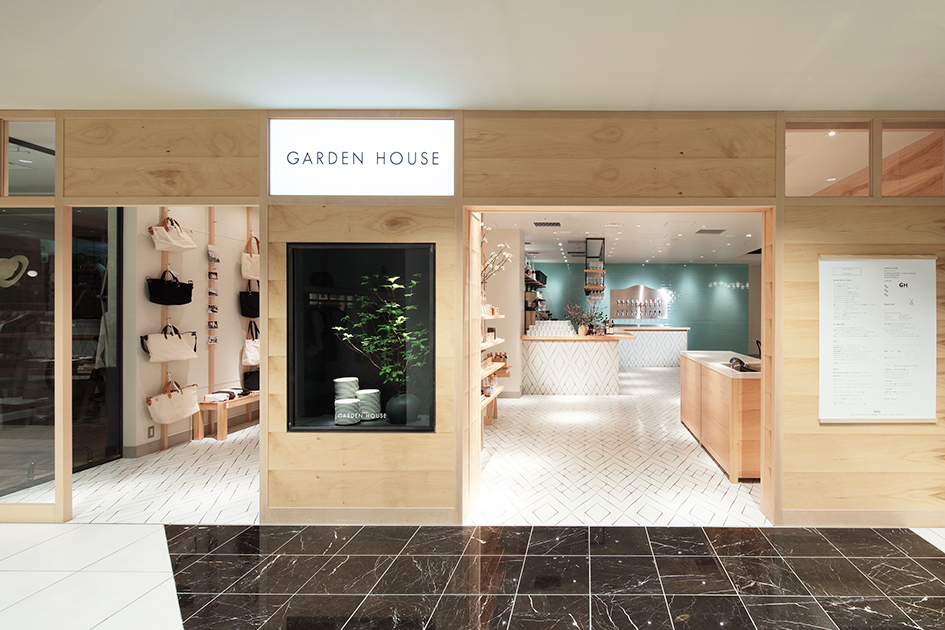
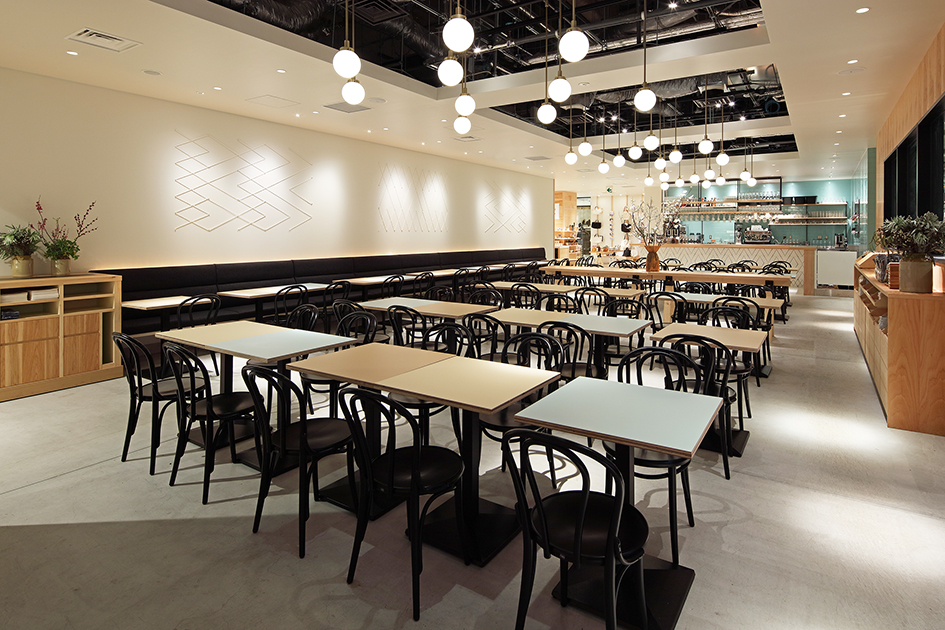
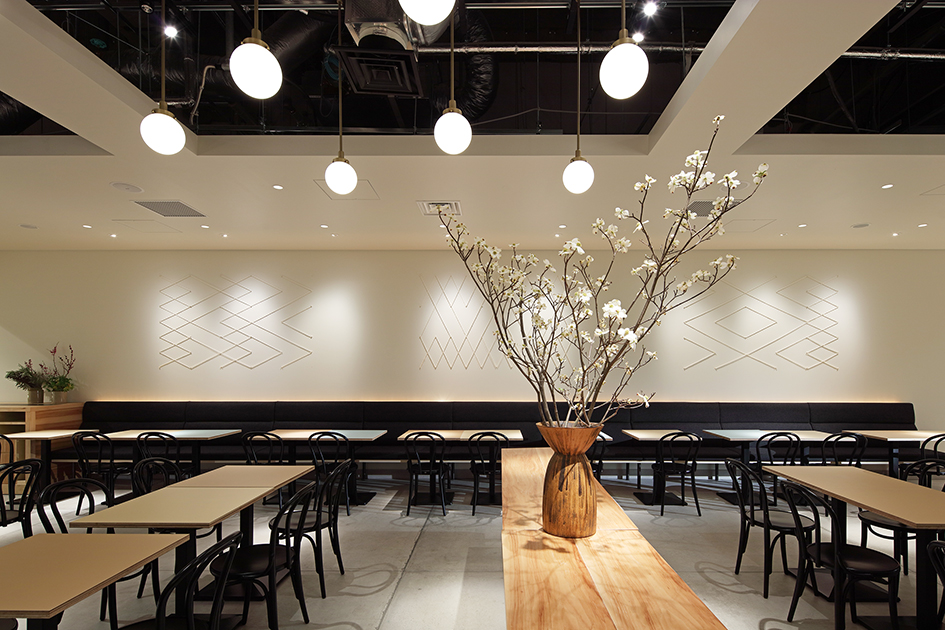
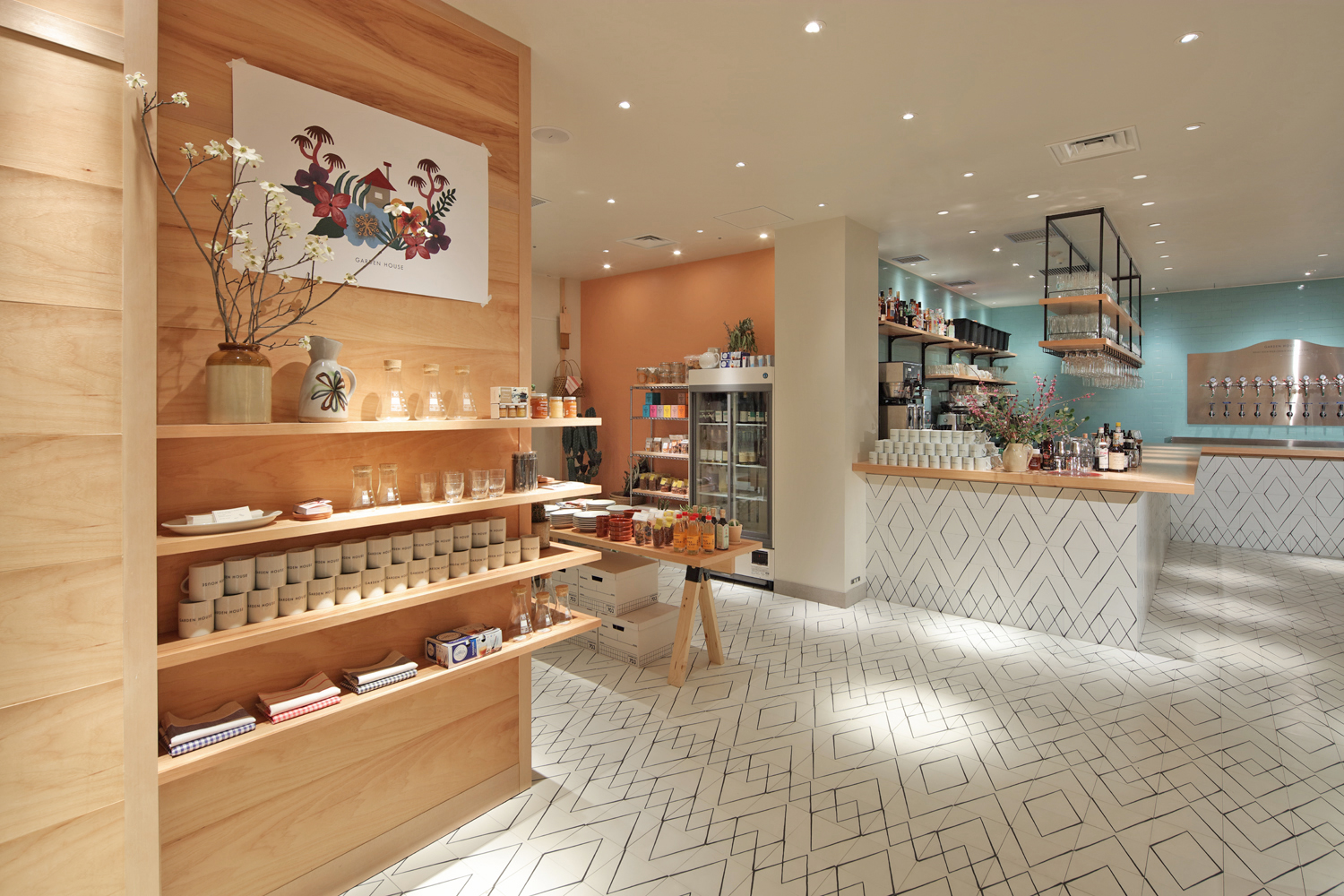
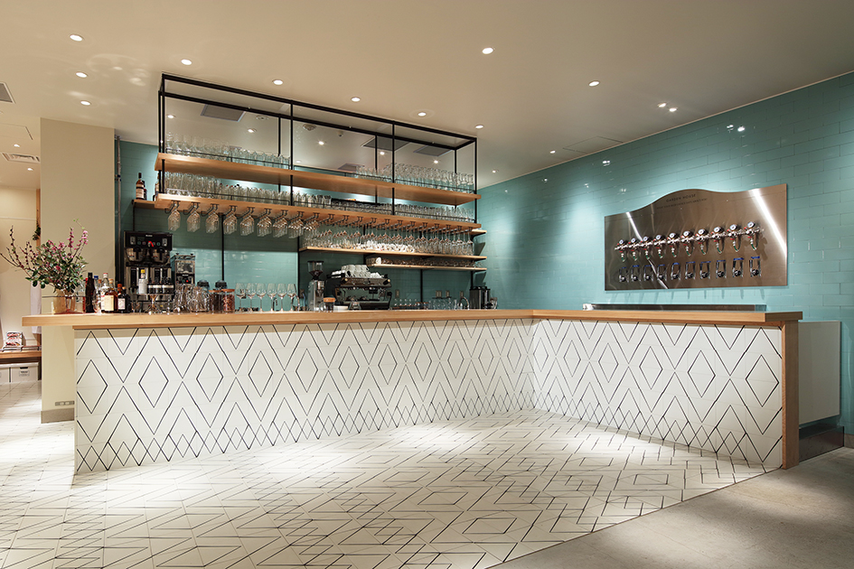
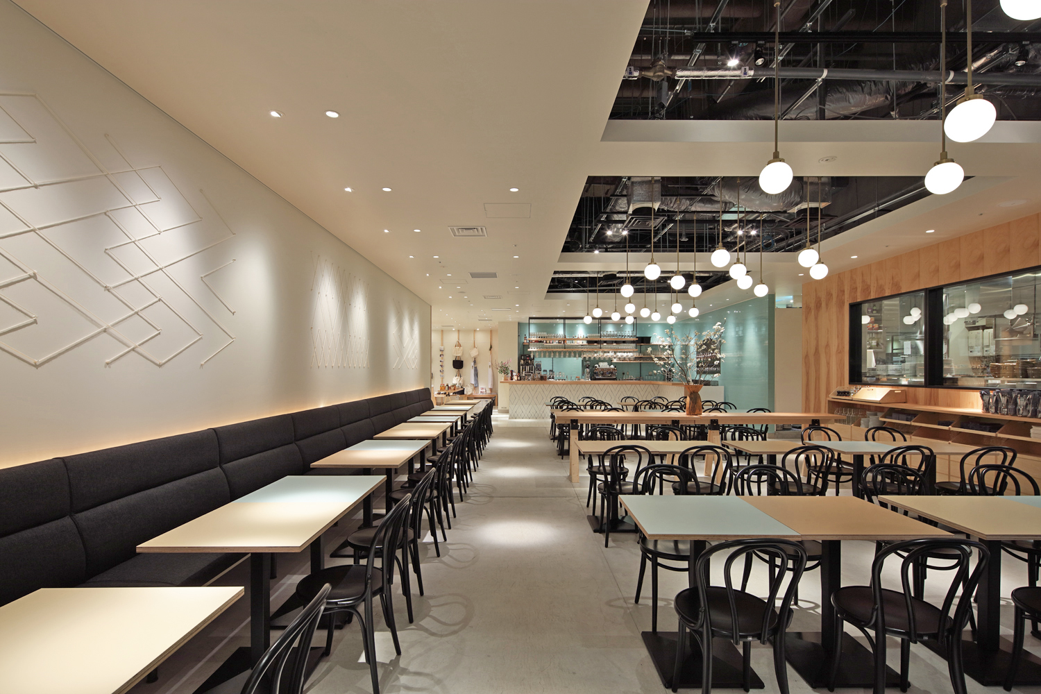
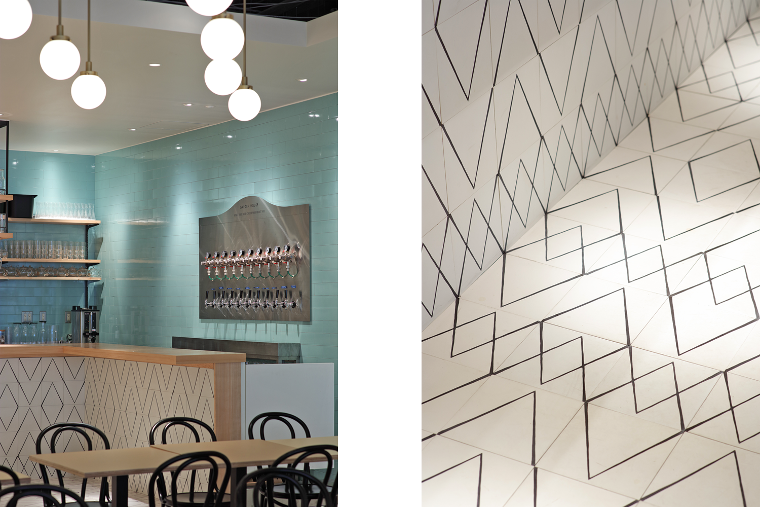
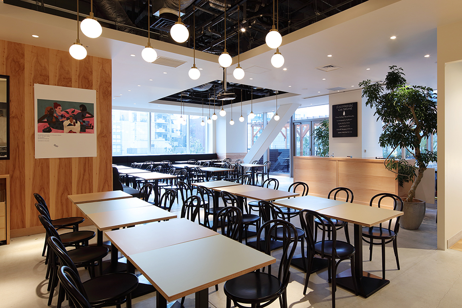
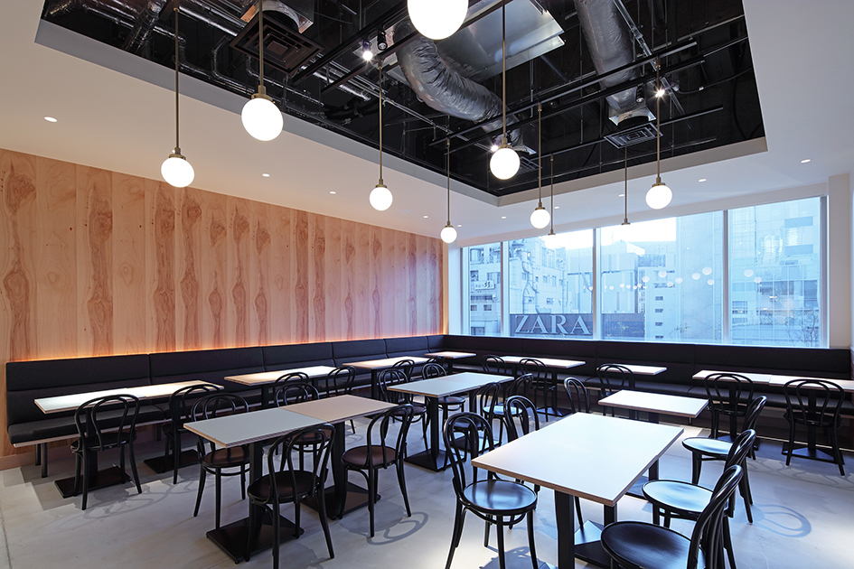
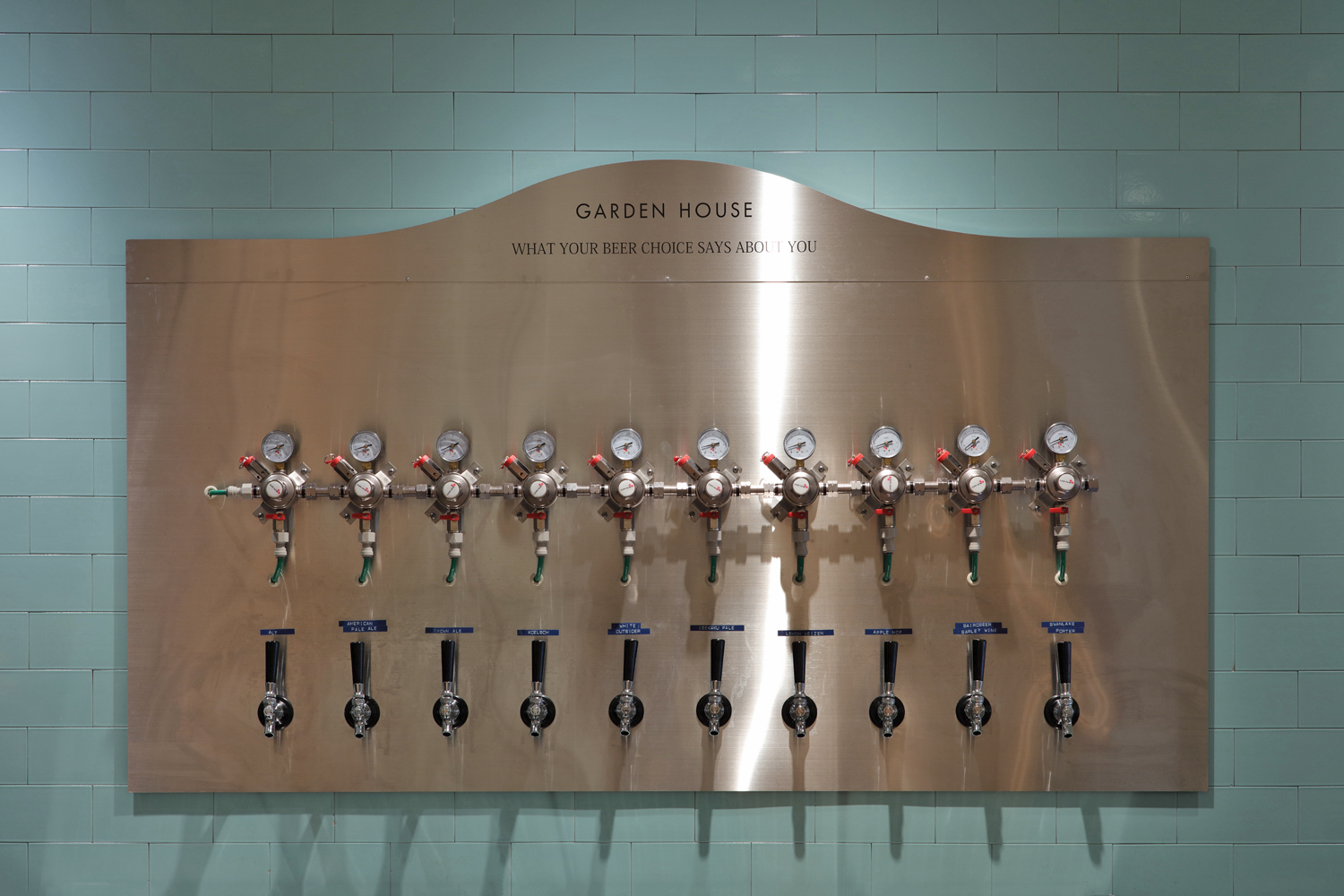
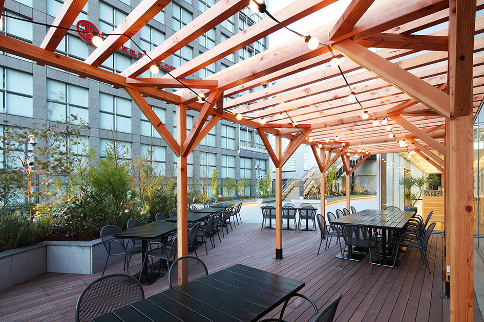
Following the 2012 success of GARDEN HOUSE in Kamakura, THINK GREEN PRODUCES has opened a second food-centered compound shop. The original, based on the theme of "Local and Craft” initially garnered a good deal of positive attention and became highly successful. Located on the 4th floor of NEWoMan complex—which has direct access with JR Shinjuku station—this new GARDEN HOUSE is both open and expansive, occupying approximately 430 square meters and including a delightful garden terrace. The concept of the Shinjuku store is, “Fine Crafts, Seasonally Inspired.” At the grand-opening of the store in Japan’s most diverse location: Shinjuku—where people, cultures and goods from all over the world come together—we charmed our first customers with this uncomplicated, realistic and functional space. We selected only ubiquitous materials and lighting fixtures to achieve a neutrality that would highlight content rather than container. In a sense, the building disappears leaving only people and product. Further, we attempted to create a flat space akin to a gallery that combines two elements as in omnipresent and ordinary. All tables and 120 seats are uniform and sized to exactly match. This simplicity enables flexibility: the tables can be easily moved and grouped to suit customers varied needs, potentially providing an artful randomness. In order to give both movement and regularity to this flat space, we adopted pale colours for the table tops. These colours conjure up the image of a "morning garden.” All this provides a perfect contrast with the hectic and kinetic environment of Shinjuku, where people constantly come and go. And so, this simple, organic space stands out: a haven in a place of constant change.
「GARDEN HOUSE(ガーデンハウス)新宿店」は、シンクグリーンプロデュースが2012年「ローカル & クラフト」をテーマに鎌倉でスタートし、そのスタイルが注目を集めた、食を中心とした複合ショップの2号店だ。JR新宿駅とダイレクトにアクセスできる複合施設「NEWoMan」の4階に位置し、ガーデンテラスを備えた約130坪の区画を持つ。新宿店のコンセプトは、「SEASON INSPIRED & FINE CRAFTS季節からのインスピレーションを大切にした品質の高い丁寧な手仕事」。世界中の人、物、文化が激しく混ざり合う、新宿という日本一多様な街での出店となったため、それらと共存し、機能するシンプルで現実的な空間を目指した。主張の強いものをできるだけ排除し、普遍的なものだけにこだわったマテリアルや照明器具を選定。ギャラリーのようにフラットで、「何年時が経っても変わらない」こと、「一般的」という双方の要素を兼ね備えた空間を意図した。120席からなるテーブル、チェアはサイズ、形を全て同じものとしモジュールを均一化することで、多様な利用人数に柔軟に対応できるレイアウトを可能にした。フラットな空間に動きと最小限の個性を与えるため、テーブルの天板には「朝のガーデン」をイメージした3色のペールカラーをのせ、各カラーのテーブルをランダムに配置。さまざまな人が往来する新宿という環境との対比により、このシンプルな空間を際立たせるという効果を狙っている。