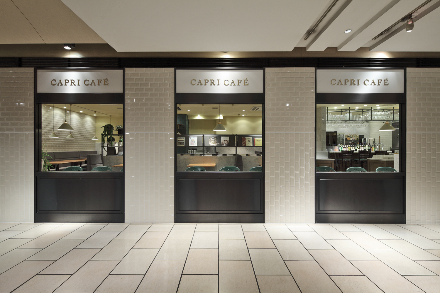
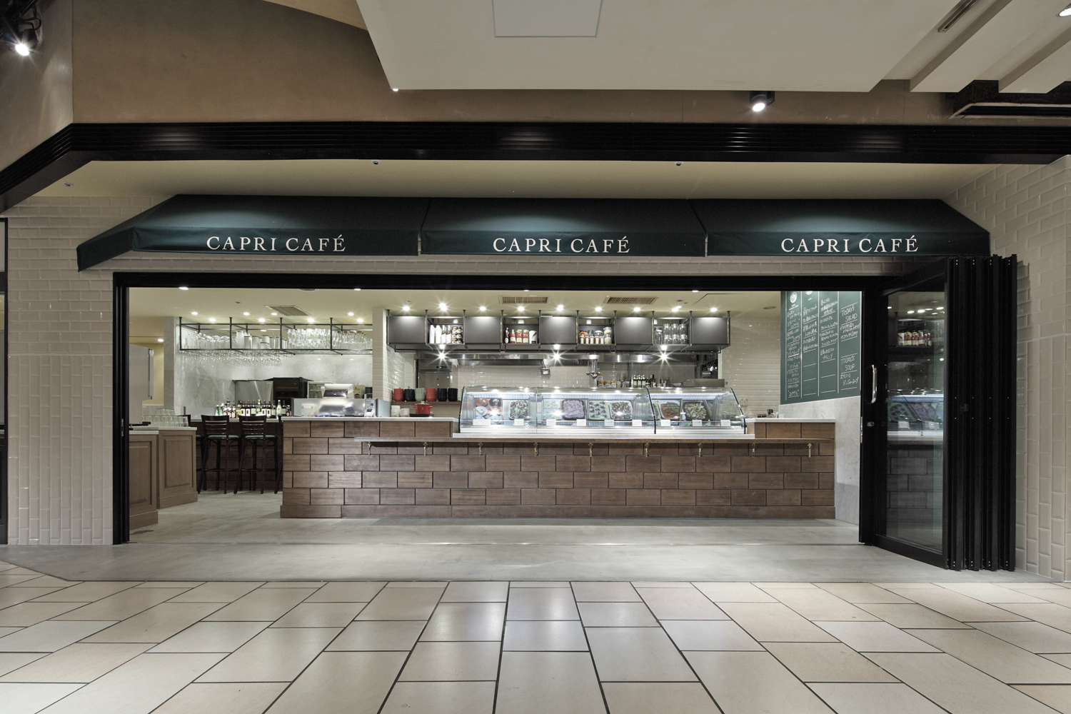
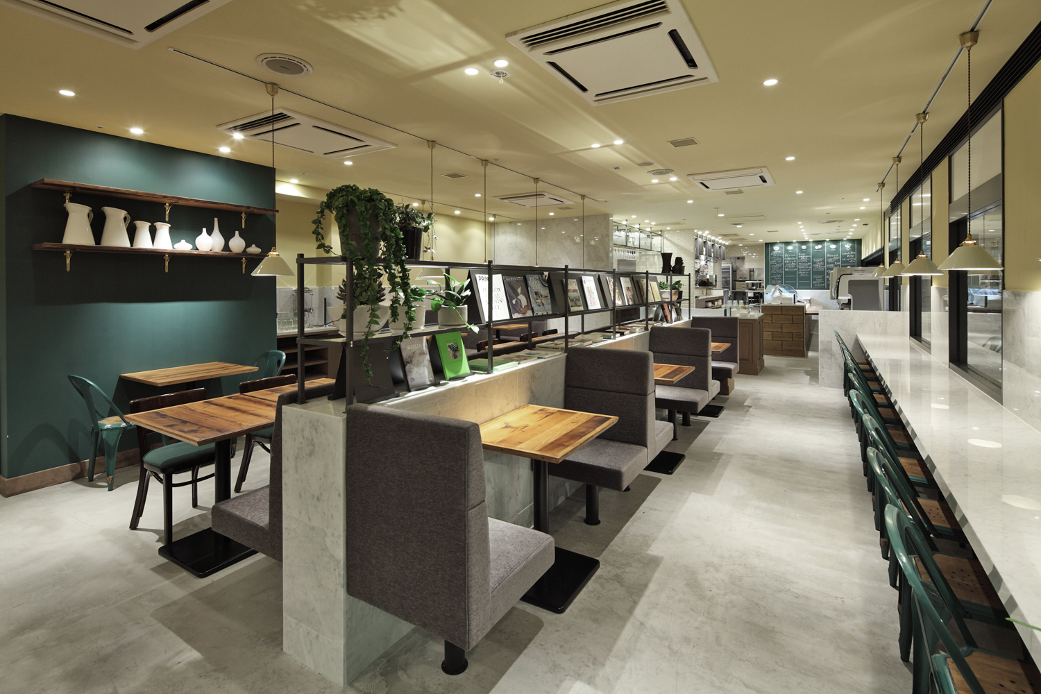
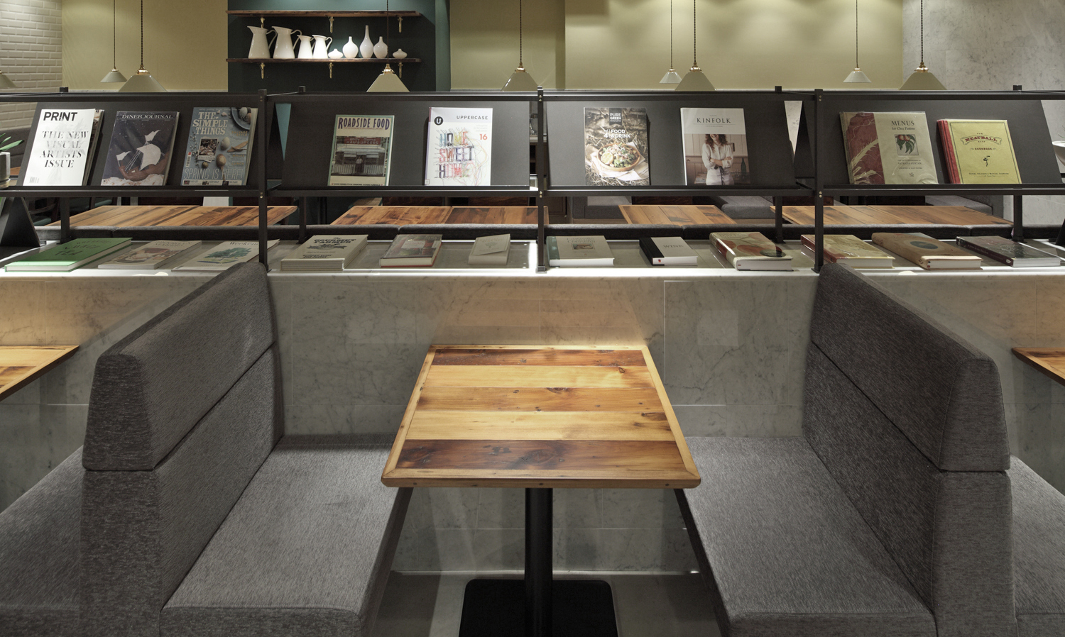
Jamo associates

Jamo associates - Project


Capri Cafe

2013.04 / Roppongi Hills , Tokyo

client
WDI
url
https://www.wdi.co.jp/
space area
149.2m2
construction trader
LUCKLAND
produce
THINK GREEN PRODUCE
lighting
FDS
photographer
Kozo Takayama

Italian restaurant chain “Capricciosa” opened “Capri Cafe", a deli-style cafe, in May 2013 at a basement of Roppongi Hills North Tower. The space was previously occupied their main brand "Capricciosa" restaurant and enjoys a high volume of passing foot traffic due to its location along a route connecting the Roppongi Hills complex to the nearby subway station. As the cafe aims to attract urban office workers who have a strong sense of authenticity, Jamo’s design focuses on a color palette derived from Italian buildings. The first step was to create a color chart using Google Maps’ street view function to check the main streets and hidden lanes of Florence. In addition to researching the colors themselves, Jamo determined the ratio at which traditional yellow and grey plaster walls appeared and used that as a guideline to determine how much of each color to use in the ceiling, banquettes, and other fixtures. In this way the space becomes a faithful recreation of traditional Italian coloring but also a current update by applying the colors to contemporary materials. In treating the exterior: windows are given architectural facade-like details to draw customers in from the corridor; wall finishing continues the attention to color with pasta-colored subway tiles.

六本木駅からダイレクトにアクセスできる六本木ヒルズノースタワーのB1階という利便性の高い立地を活かし、2013年5月8日にカジュアルイタリアン「カプリチョーザ」からデリ形式のカフェとしてリニューアルオープンを果たした「カプリカフェ」。自分なりの価値観を持った本格志向の強い都会のオフィスワーカーをターゲットにした同店の空間を作るにあたり、着眼したのはイタリア建築の持つ独特のカラーリング。まず、Google mapのストリートビューを使い、フィレンツェの街を隈無くリサーチしながら、独自のカラーチャートを作成。色そのものに加え、イエローとグレーで構成される伝統的な漆喰壁の色の比率を割り出し、そのガイドラインに沿って、天井やソファの色の分量を決めていくなど、イタリアの色様式を忠実に再現しながらも、時代に併せたマテリアルに色を載せ変えることで、現代的な空間へとアップデイトした。外観は共用部からの誘客を考え、あえて窓を造作し、建築のような趣に。壁面にパスタカラーのサブウェイタイルを採用するなど、色へのこだわりは細部にまで及んだ。

X