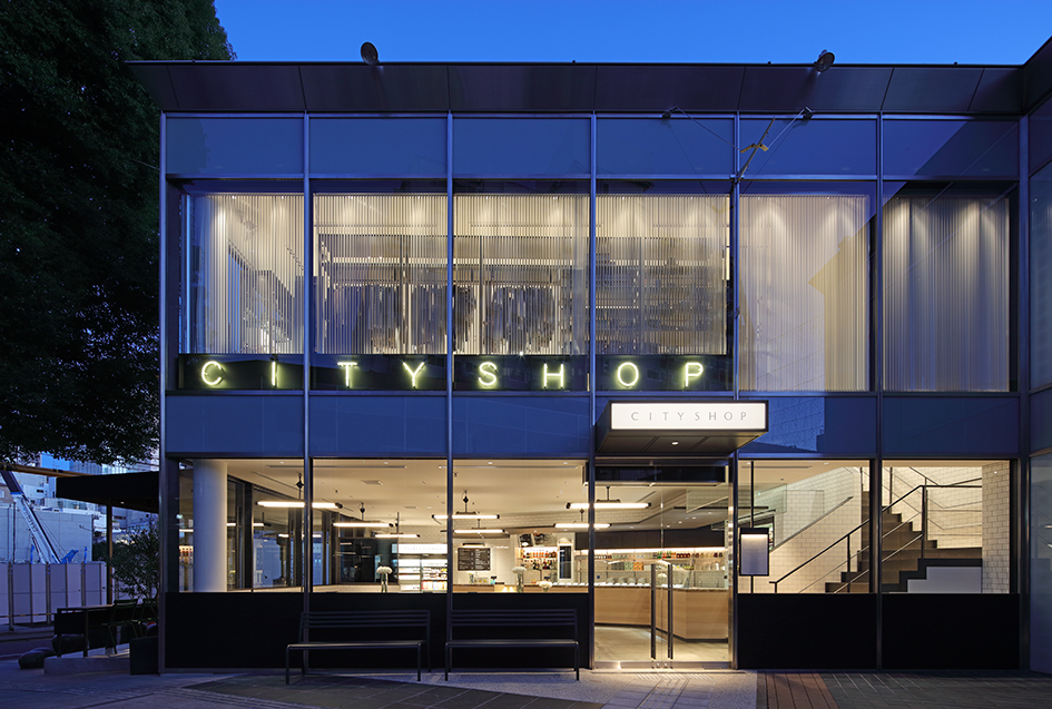
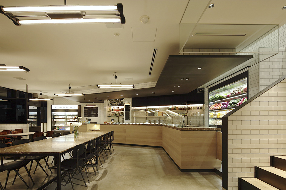
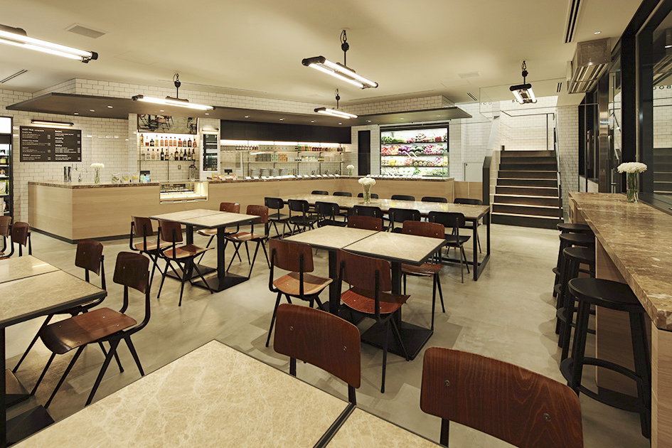
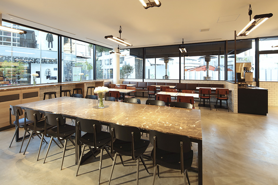
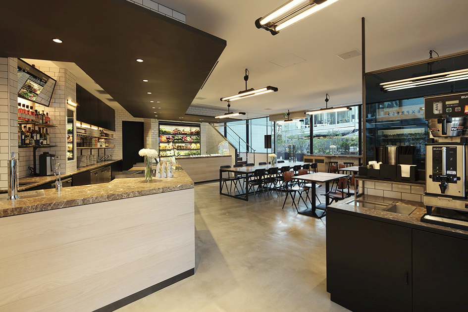
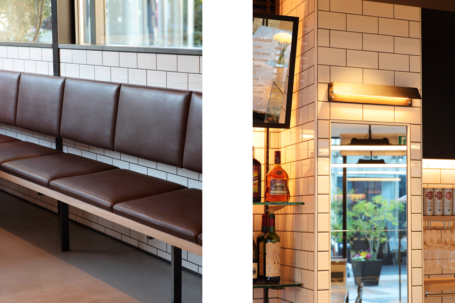
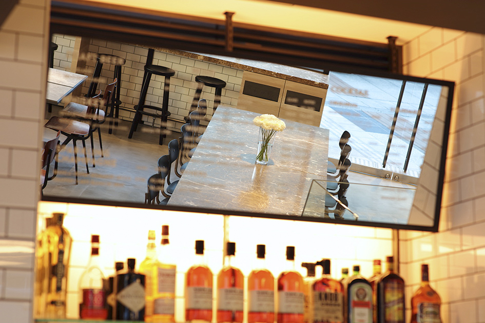
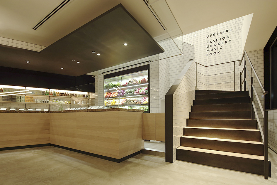
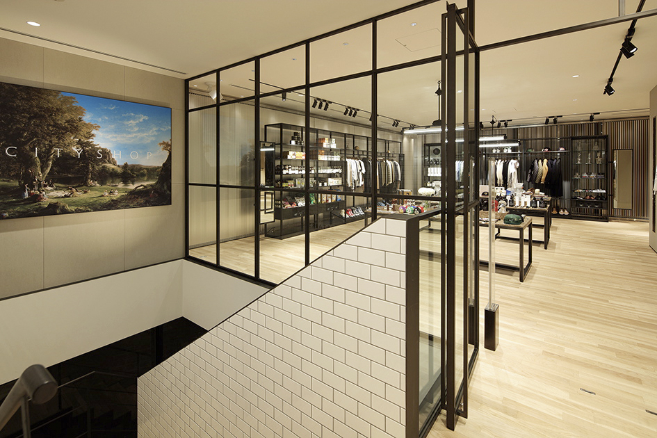
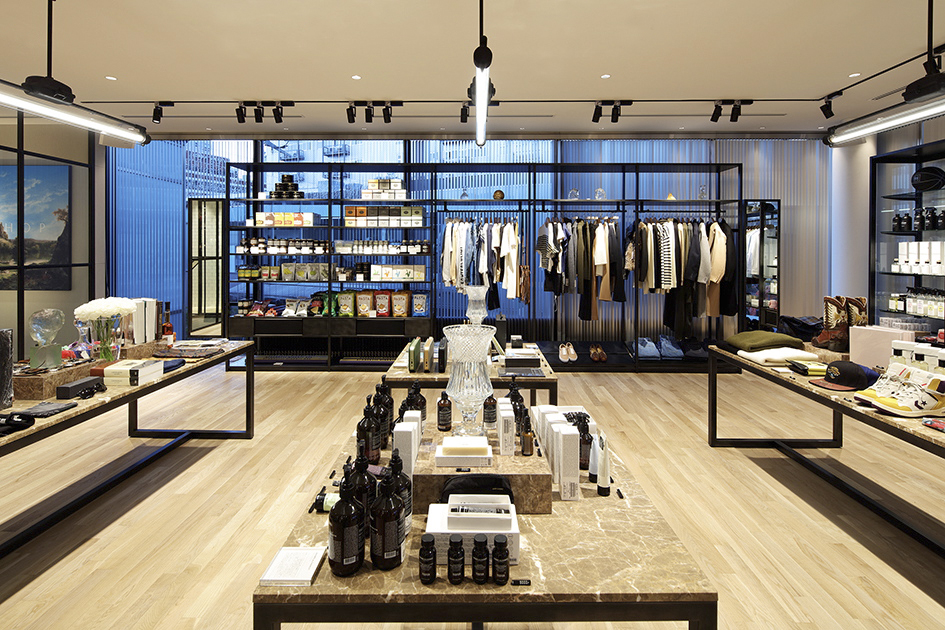
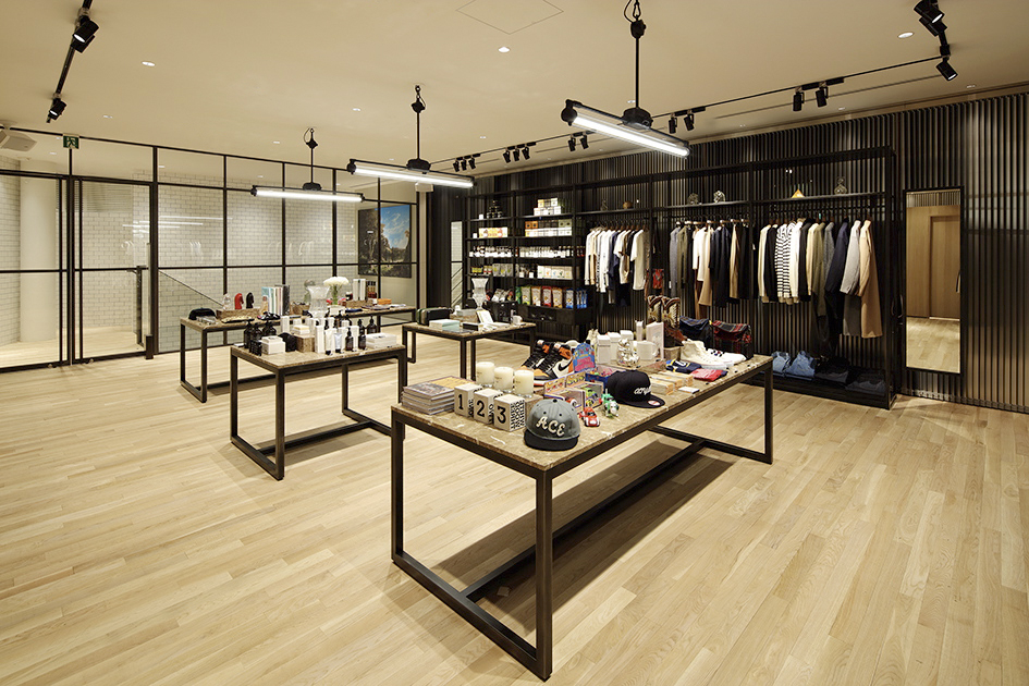
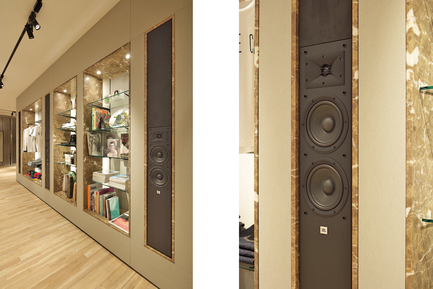
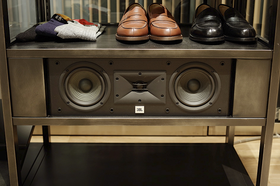
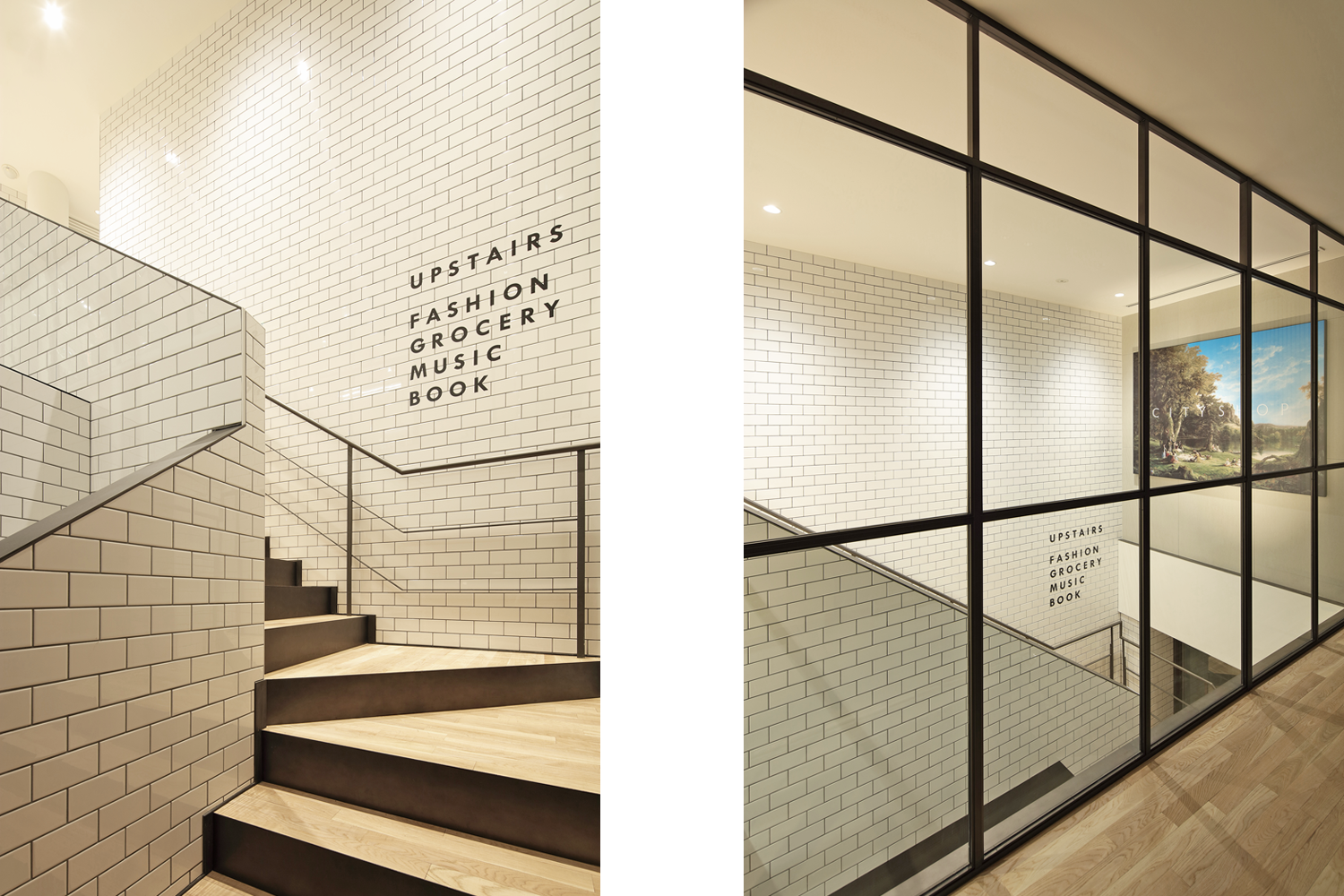
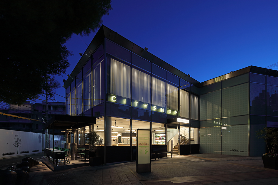
Jamo associates

Jamo associates - Project

CITYSHOP

2015.12 / Aoyama , Tokyo

client
BAYCREW'S CO.,LTD.
url
http://cityshop.tokyo
direction
Yuichi Yoshii ( PARIYA )
space area
248.13m2
construction trader
NOMURA
photographer
Kozo Takayama

CITYSHOP is a new type of business created by BAY CREWS INC. and inviting Mr. Yuichi Yoshii as creative director. CITYSHOP is, in fact, a flagship concept store where fashion, food and culture merge. Located in the refined shopping centre GLASS-AREA AOYAMA, in Minami Aoyama 5-chome, the ground floor features a delicatessen, bar and terrace. Upstairs are fashion and culture stores. With this arrangement, our goal is to engender a high quality daily lifestyle. Indeed, ”Standard" and “Daily" are the only two key words given by creative director, Mr. Yoshii. From this, we aimed to create a space where people could enjoy an authentic and yet refined experience—as well as playing a leading role whilst co-existing within the city. With the interior, while intentionally avoiding predictable placements, we endeavoured to finalise materials, colours, shapes, light and details only from the simple inspiration conveyed by the store name: CITYSHOP. For example, the arrangement of square shaped furniture is reminiscent of a building group. Colour schemes evoke greyish and smoky tones of the city. Durable strong and hard materials, line lighting and silver aluminium blinds continue this theme. With well considered speaker placement providing the suggestion city noise, the effect is complete. Just as scenery emerges in the mind when listening to music, after countless dialogues with the creative director, Mr. Yoshii, we deconstructed the key word, “CITY” and gave it form.

「CITYSHOP(シティショップ)」はベイクルーズがクリエイティブ・ディレクターに吉井雄一氏を迎えて生まれた新業態で、ファッション、フード、カルチャーが融合したコンセプトショップの旗艦店。南青山5丁目、「グラッセリア青山」内に建つ2層からなるストアの1階にはデリカテッセンとバー、新設したテラス。2階にファッション、カルチャーの売場が構成され、日常における質の高いライフスタイルを提案している。ディレクターの吉井氏から与えられたワードは「スタンダード」と「デイリー」。このテーマを元に、街と共存し、時代の試練に耐えうる不変で普遍的な「人」が主役となる空間を目指した。インテリアにおいては、あえて論理的な組み立てを避け、シンプルに「CITYSHOP」という店名の響きから受けるインスピレーションのみで、それぞれの素材、色、形、光、ディテールを落とし込んでいった。ビル群を思わせるスクエアな什器形状と配置構成。都会のグレイッシュでスモーキーなカラートーン。経年変化に強く硬いマテリアル。整然と配置されたライン照明、シルバー色のアルミブラインド。都市のノイズを表したスピーカー配置など……。音楽を聴いている時に頭の中に景色が浮かび上がるような素直な感覚で“CITY”というワードをひも解き、吉井ディレクターと対話を重ねることによりカタチにした。

X