anima
2012.3 / Harajuku , Tokyo
- client
- WORLD
- url
- http://www.world.co.jp
- produce
- THINK GREEN PRODUCE
- direction
- Maiko Ichikawa
- space area
- 306m2
- construction trader
- NOMURA
- art director
- PARK. / SUTHERLAND
- lighting
- Tetsuya Miyagawa / LDR × 1LUX
- photographer
- Kozo Takayama
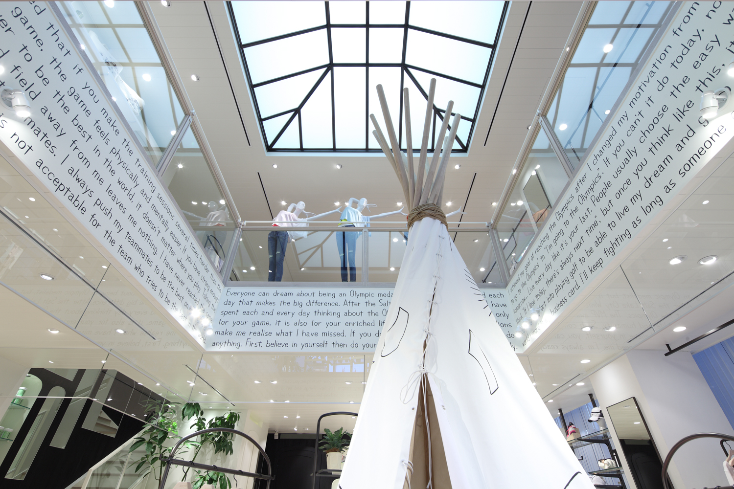
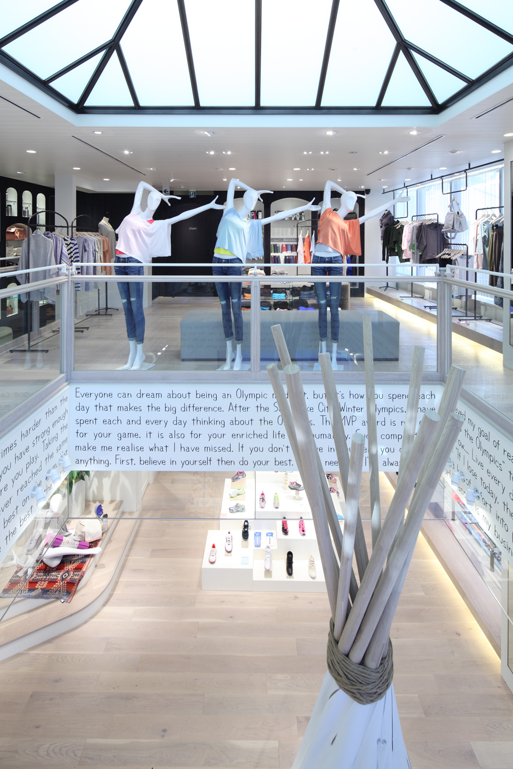
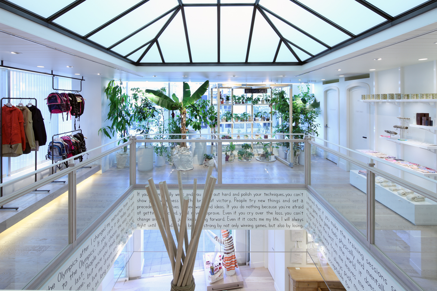
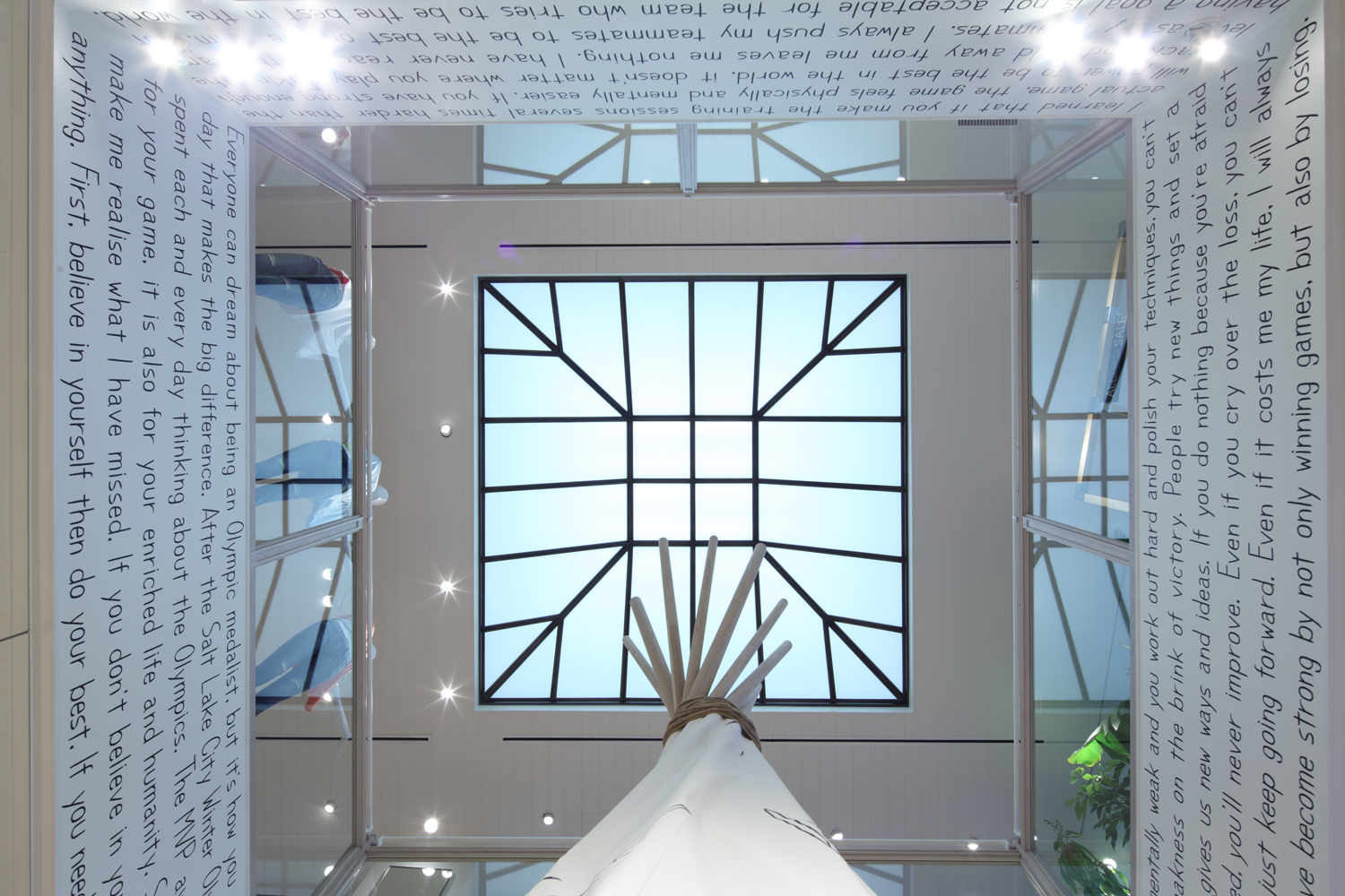
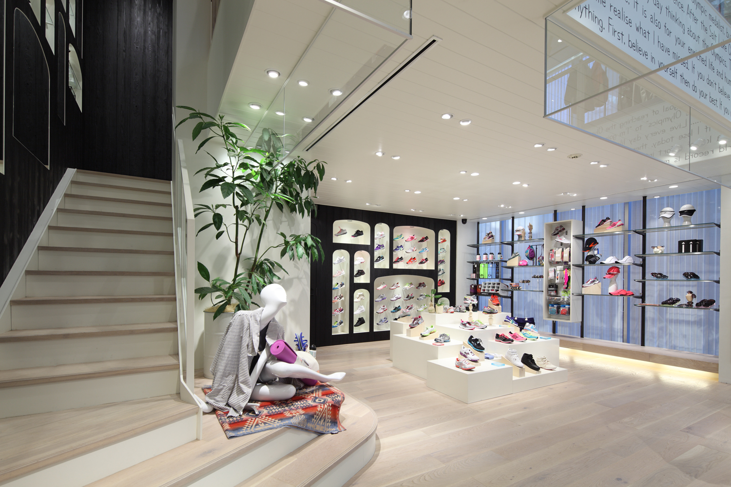
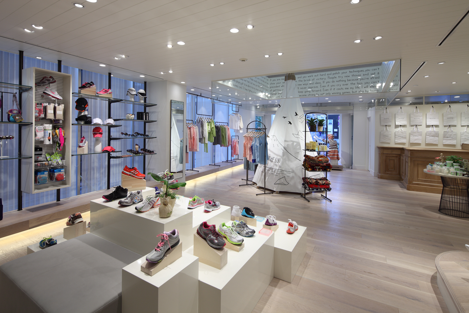
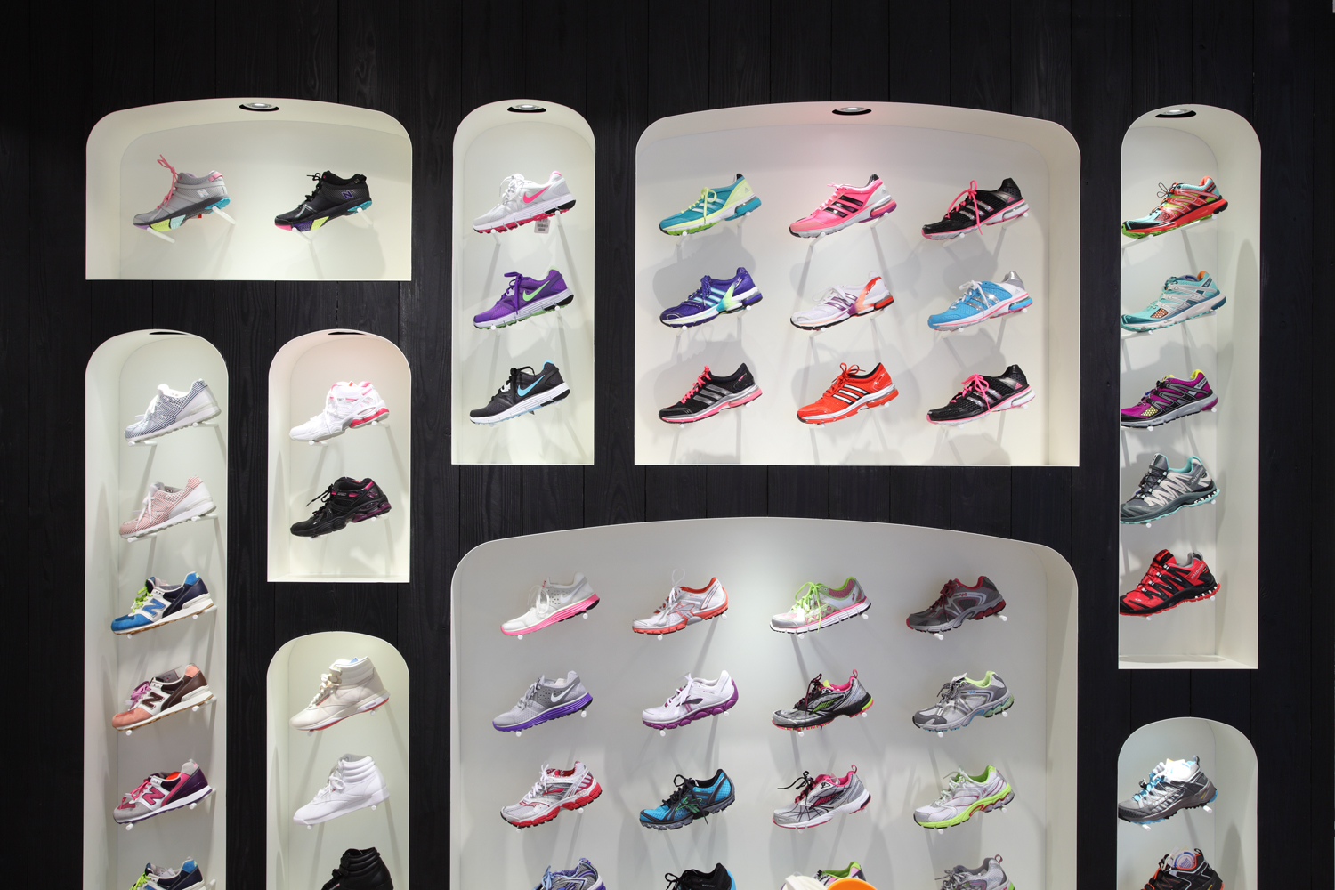
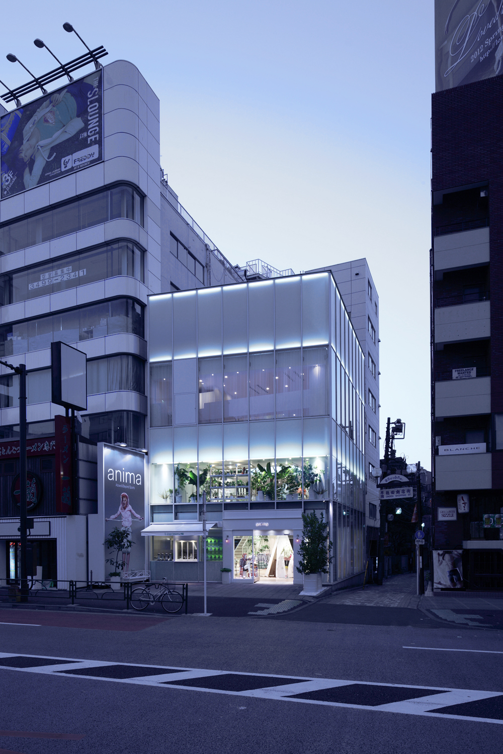
Anima is a new women’s sportswear brand by Japanese apparel manufacturer World and is centered around “running, fitness and yoga”. For the opening of the flagship store in Harajuku, the brand’s director proposed the theme of a “sharp” and “clean” interior. With that in mind, Jamo used a monotone foundation of black and white together with wall treatments that highlight their rustic materials to create a greater sense of depth and dimensionality in the space. The design of the black fixtures and stairs from the first floor are continued where Jamo has increased the floor space of the second floor sales area. While using such devices to increase the number of shoppers going to the upper floor, Jamo also used a prominent skylight to bring shoppers’ sight upwards. The space was given a greater sense of openness. Vertical blinds were used on the facade to make the building appear more slender. In the end, Jamo was able to create an exterior that serves as a symbol for this design conscious sportswear brand.
ランニング、フィットネス&ヨガ、アウトドアの3つのカテゴリーを主軸に本物志向の女性に向けたスポーツウエアを展開する、株式会社ワールドの新ブランドanima。その旗艦店となる原宿店のオープンに際し、ディレクターが掲げたテーマは、シャープでクリーンな空間。その解題として、モノトーンを基調にしながらも、ラスティックな素材感を際立たせた壁面の仕上げなどで、立体感ある表情と奥行き感を演出。また、既存の吹き抜けを埋め戻し、2階部の売り場を増床するにあたり、1階の黒い什器と階段部の意匠を連続させ、上階率を高める工夫を凝らすとともに、トップライトに見立てた光天井で視線を上へと誘導。空間に自由と広がりを持たせた。加えて、建物全体をスリムに見せるために、ファサードには縦型ブラインドを採用。デザインコンシャスなスポーツブランドのアイコンとなる外観に仕上げた。